CSS Input Forms

Overview
This is just a reference and not a full lesson, find full lessons in the App Builder, Coding, Game Maker, Iot Builder, or Data Representation sections.
The CSS
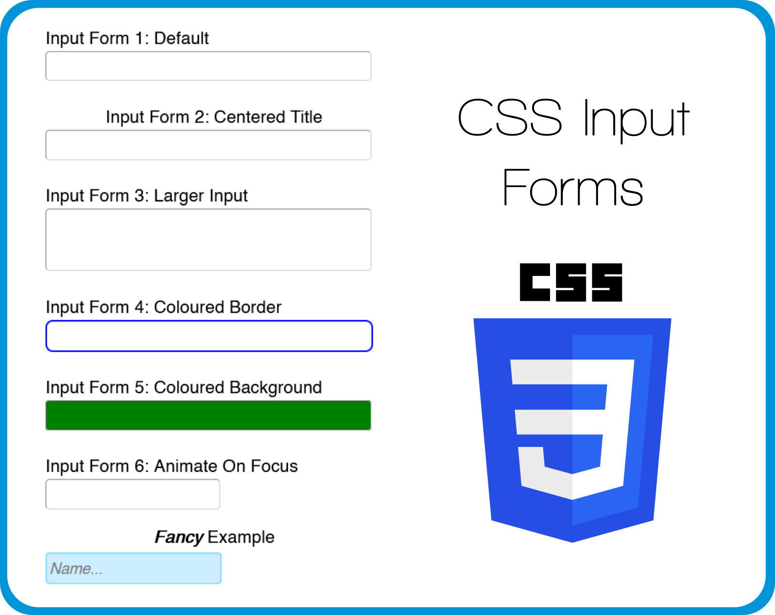
Here is the CSS used to style the input forms in the demo app, each input form has its own custom class which is in the name (input1, input2...)These custom classes are set in the style section when editing the input form.
.input2 {
text-align: center;
}
.input3 input{
height: 50px;
}
.input4 input{
border: 2px solid blue;
border-radius: 6px;
}
.input5 input{
background-color: green;
}
.input6 input{
width: 50%;
transition: 2s;
}
.input6 input:Focus{
width: 95%;
}
.fancy1 input{
width: 50%;
transition: 1s;
border: 2px solid #99DDFF;
background-color: #CCEEFF;
color: grey;
font-style: italic;
}
.fancy1 input:Focus{
width: 97%;
height: 30px;
border: 2px solid #3399FF;
}
.fancy1 input:Hover{
background-color: #B4BCDC;
}
Load the Template
If you would like to load the finished template of this App into your account to edit and learn from you can do so by:
- Create a New App by clicking the plus button in the App Builder
- Click on Templates
- Search for CSS Input Forms
- Click Use
- Click Yes
- Click on the New Tab that was added to your App
- Click Navigate
You can find the custom class (input1, input2...) of each input form by clicking on the input form and then clicking edit and then style, the custom class can be found in the Custom Class box at the bottom of the page.
The CSS can be found and edited by clicking on the screen name (CSS Input Forms), clicking Edit, and then clicking Advanced, the CSS is located in the Custom CSS block.


